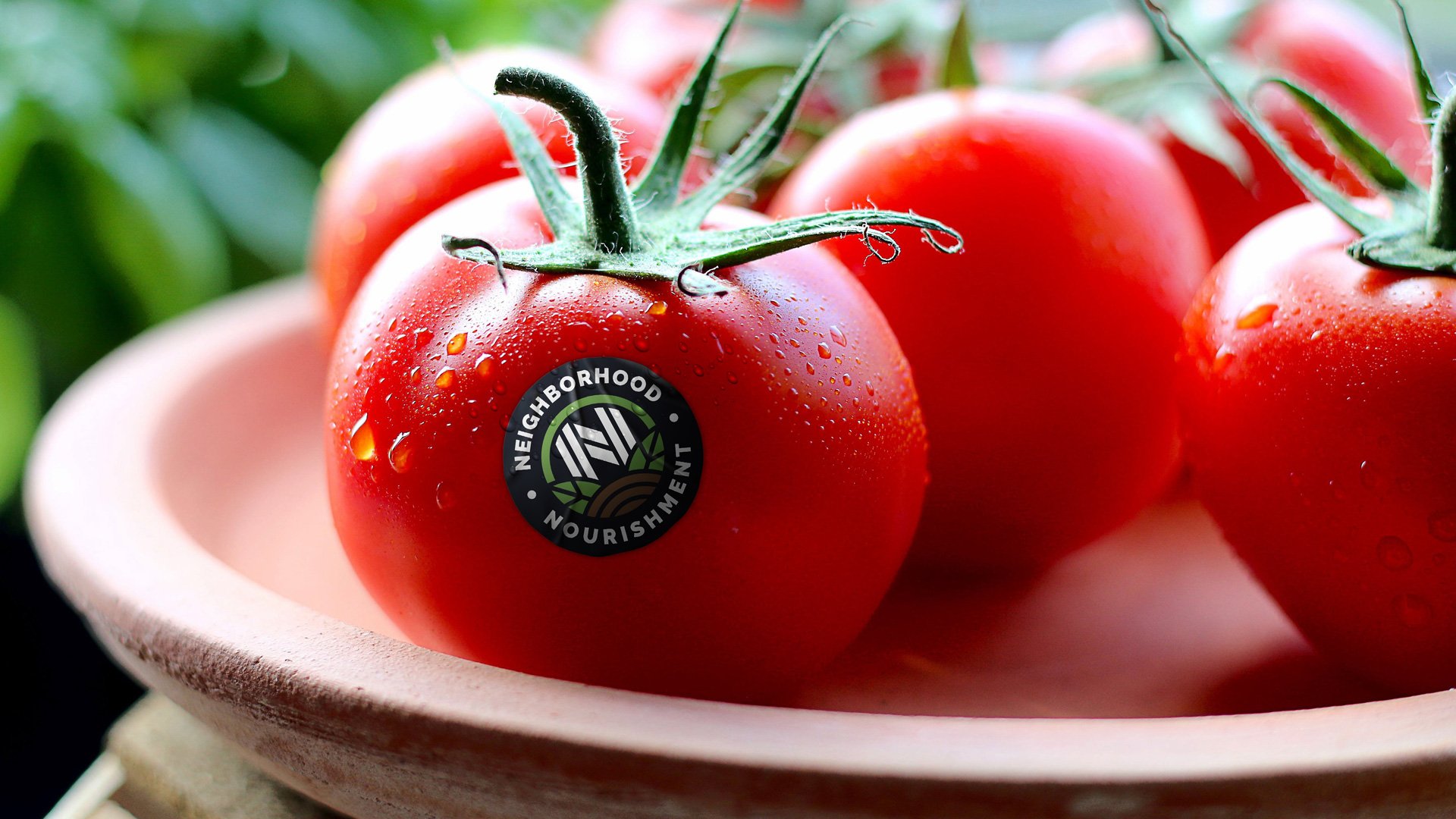
Neighborhood Nourishment is a farmers’ market on wheels. Essentially, home delivery fused with fresh, local foods. Their target audience are mothers and the typical grocery buyers.
Client wanted modern logo, a bit of the vintage vibe and possibility to translate initials NN into a standalone mark which could be used further on different media and packaging.
We came up with this modern yet refined style with the emphasize on symmetry which has been further enhanced by using uppercase letters around the main image.
Emblem was featured in the 2018 logo design guide eBook – “How to get the perfect logo for your brand”.


